Rebuilding an outdated lead aggregation platform, increasing conversion rates by almost 20%
Highlights
video
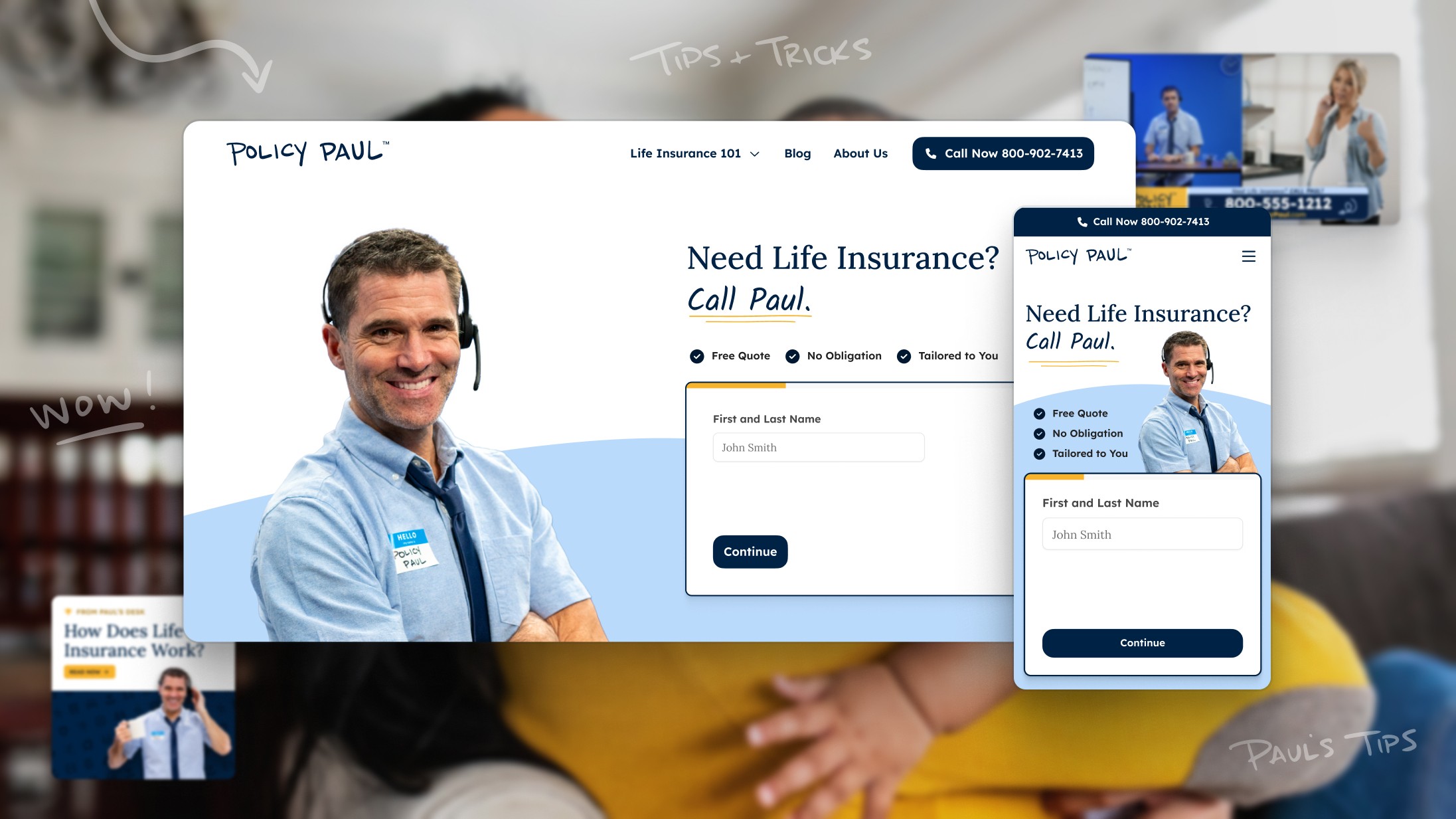
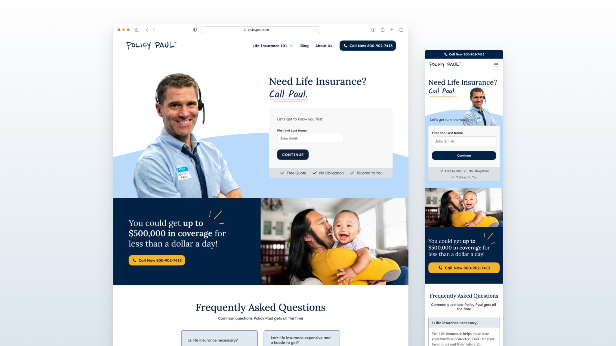
Mobile web overview.
slideshow
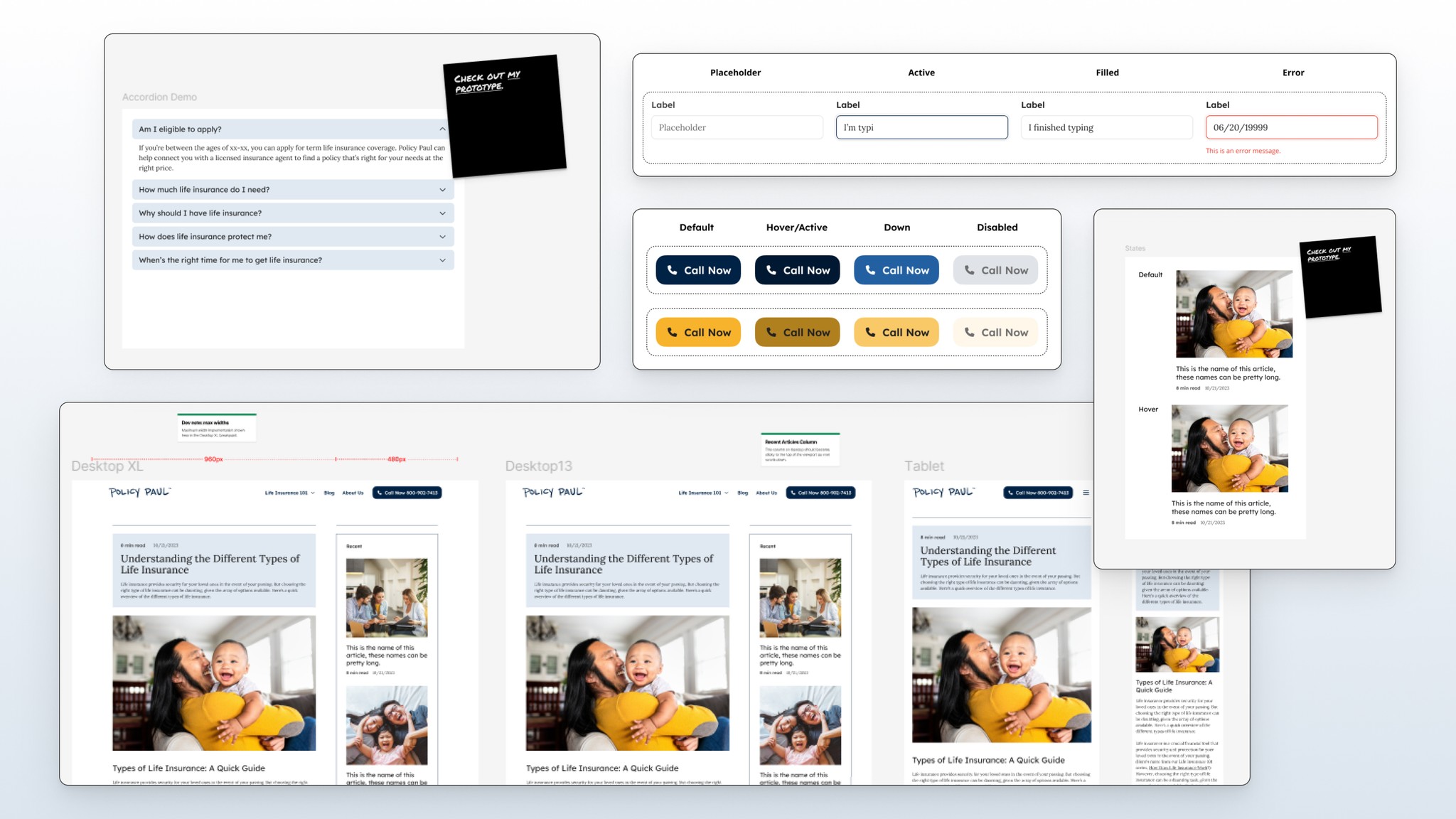
Accessory pages.
context
What and who is Policy Paul?
Nearly half of Americans lack life insurance, despite the industry’s $261 billion market value. Policy Paul was created to disrupt this space by streamlining connections within the insurance industry. As our new lead aggregation platform, it aimed to simplify access to life insurance and carve out a new vertical in the market.
This project started as a lower-priority task managed by a much smaller part of the team, so I had to quickly get familiar with their work and understand how we wanted to build on it.
The problem
An outdated experience in a mature market
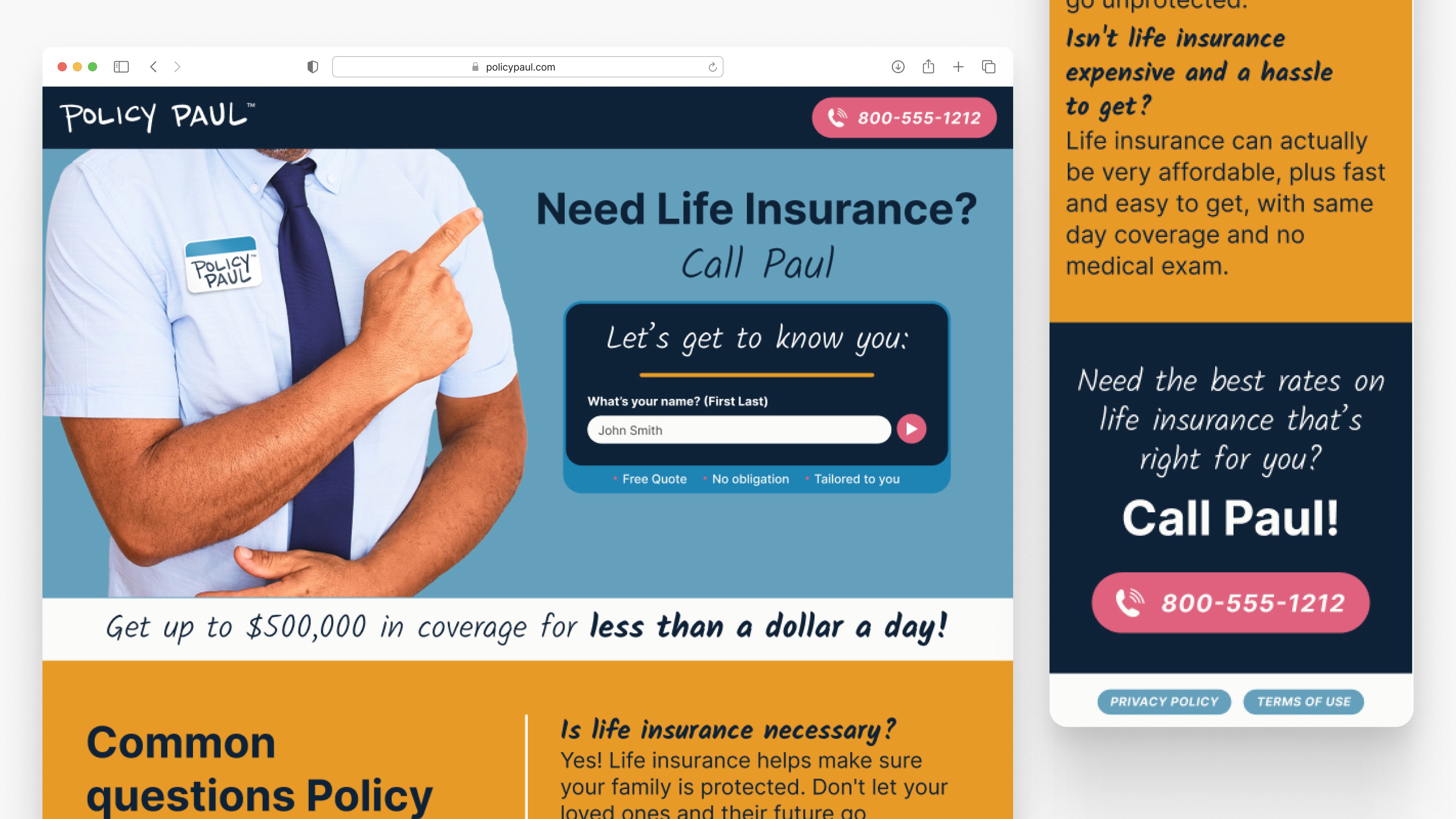
Entering a mature market like life insurance requires a platform that establishes trust and delivers a seamless user experience. However, Policy Paul’s initial design was outdated with a fragmented brand that fell short, creating significant challenges for the redesign:
The web experience struggled with accessibility and adherence to best practices.
The brand lacked credibility and modern appeal, with a disjointed color palette that failed to convey trust.
The lead-collection form was ineffective, leading to poor user journeys and fewer conversions.
The redesign, which involved a lot of ambiguity in the beginning, had to be completed within a two month deadline.
project goals
How might we build a unified brand and web platform that effectively connects customers with life insurance options?
Help determine the visual strategy for the Policy Paul character
Improve accessibility and best practice usage in our lead-collection form
Lay the foundation for a scalable design system
Build out additional content per marketing/strategy team
The process
What it took to get there
Designing impactful solutions is rarely a linear journey. It’s a dynamic, iterative process that often loops back on itself, with unexpected challenges and discoveries along the way.
From brainstorming and prototyping to refining ideas, this project demanded flexibility, a willingness to embrace ambiguity, and the courage to pivot when insights revealed new opportunities.
Breaking down priorities
With incomplete PRDs, no finalized copy, and a missing visual strategy for our main character, I had to navigate significant ambiguity to establish a clear path forward. After quickly familiarizing myself with the existing state of the project, I identified key priorities to create a focused direction and drive progress:
Conduct a thorough audit of the current platform to understand it's primary shortcomings
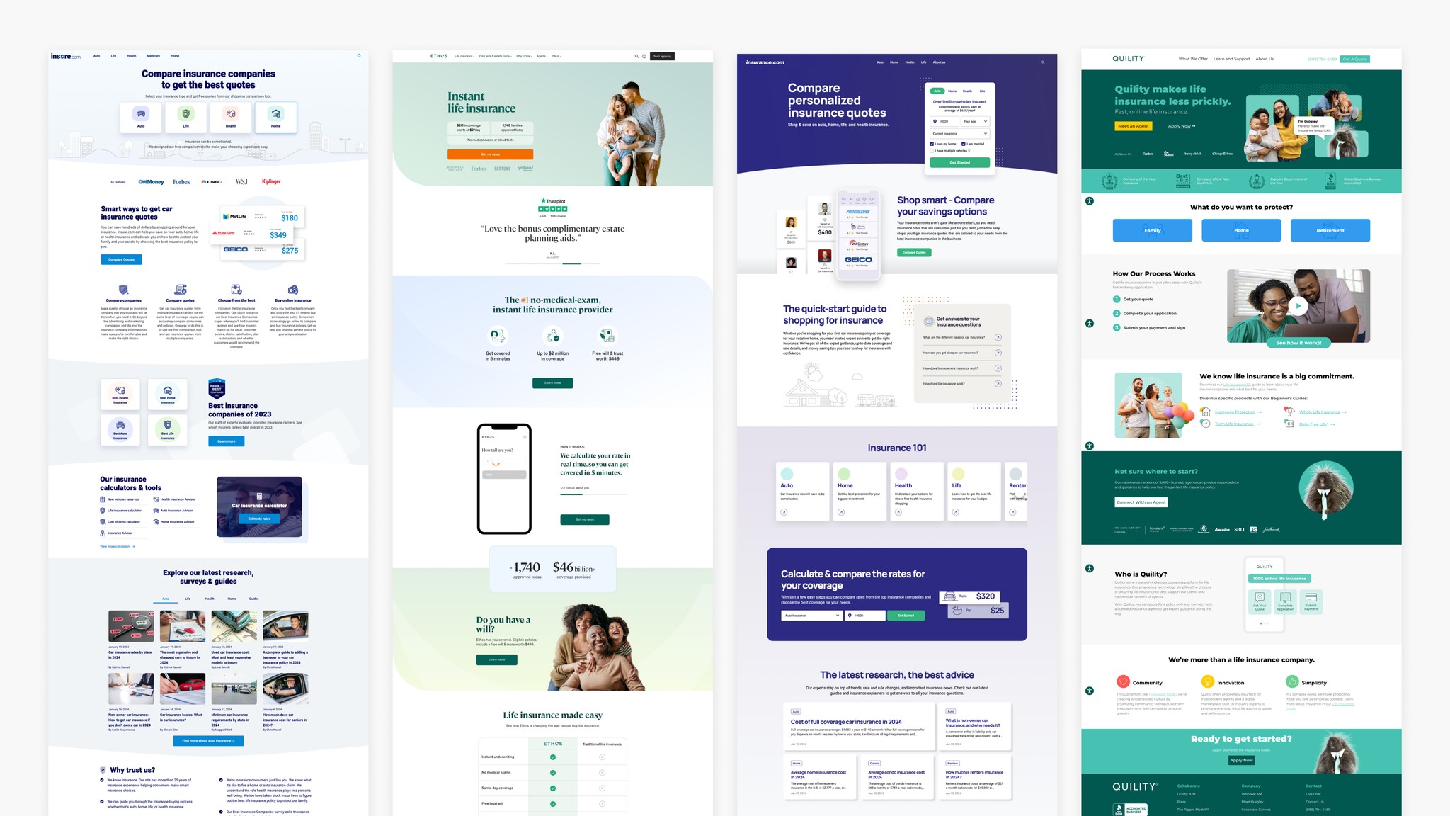
Perform a competitor analysis to identify standards and opportunities for differentiation
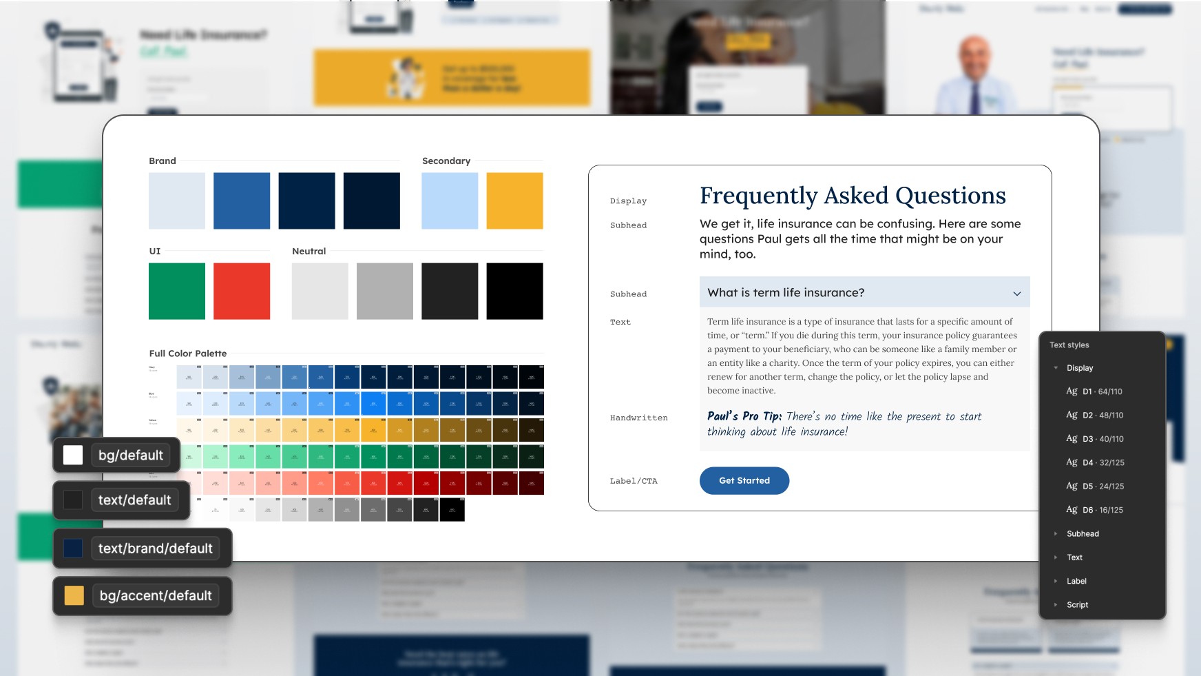
Rebuild the brand to an MVP state for credibility and trust
Lay the foundation for the required webpages
Signal vs. noise
The audit revealed a lack of cohesion in the brand's visual identity, with clashing blues and competing secondary colors dominating the palette, and minimal use of neutrals for balance and layering. Typography and color choices failed to convey a tone of trust and professionalism, falling short of competitors' standards. The team's hypothesis was that these shortcomings hindered the user experience, leading to fewer leads.
Knowing what to not focus on in a project like this is as important as knowing what to pay attention to. We avoided introducing overly complex features or interactions that didn’t directly enhance usability, deprioritized perfection in non-essential areas to maintain momentum, resisted visual overload that could distract from clear calls to action, and kept the design system scoped to the immediate needs of the MVP. This helped to ensure resources were spent where they mattered most.
Driving alignment and momentum
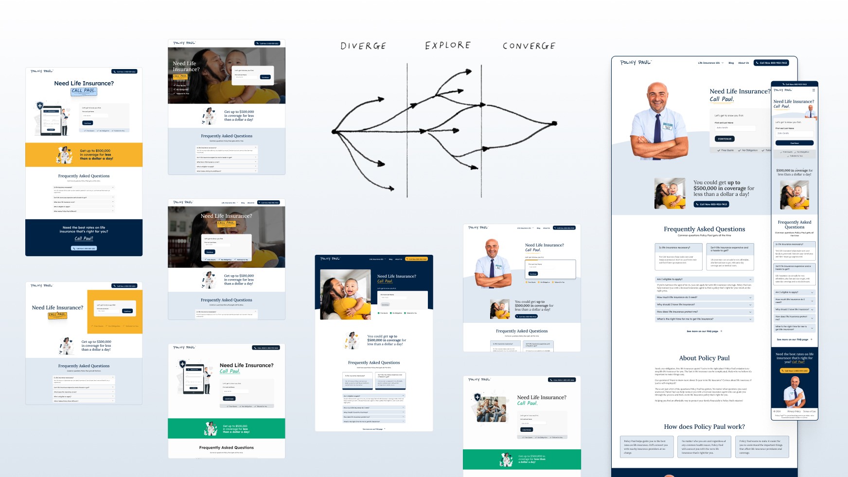
After refining the best ideas from all iterations, I paused to realign with stakeholders and cross-functional teams working on various aspects of the project.
Sharing our work with as many teams as possible that were involved with this client is when the lightbulbs started turning on. For teams across growth and creative, it helped them gain clarity, orient their efforts, and build momentum through the ambiguity we were all navigating.
Bringing it together
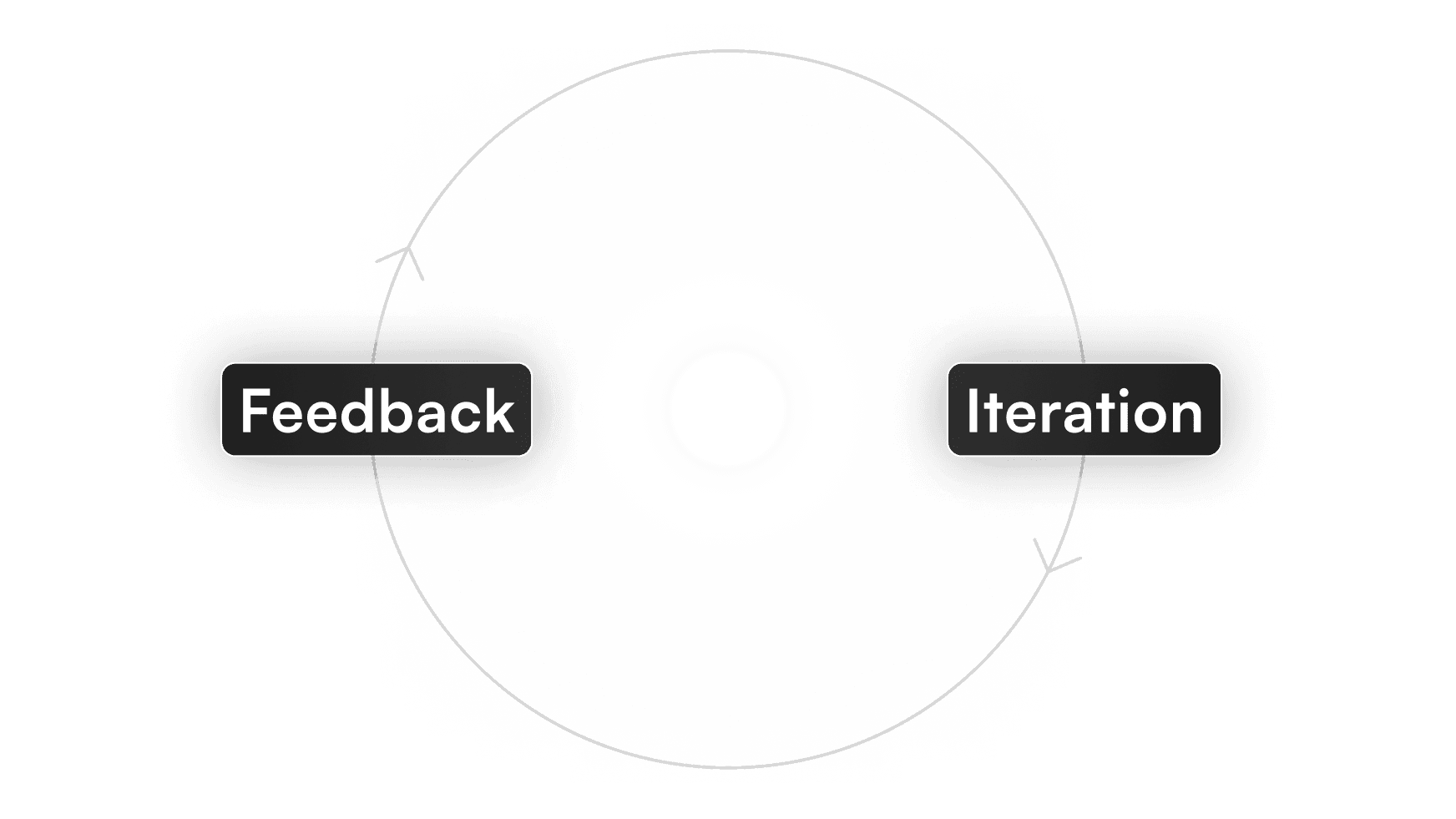
We went through several rounds of iteration to refine the design, focusing on aligning with user needs and design goals while building a cohesive design system. Collaborating with the copywriter and creative team, we solidified the brand strategy, striking a balance between professionalism and approachability. Together, we developed a visual strategy for our main character that aligned with the updated, competitive brand identity.
Image
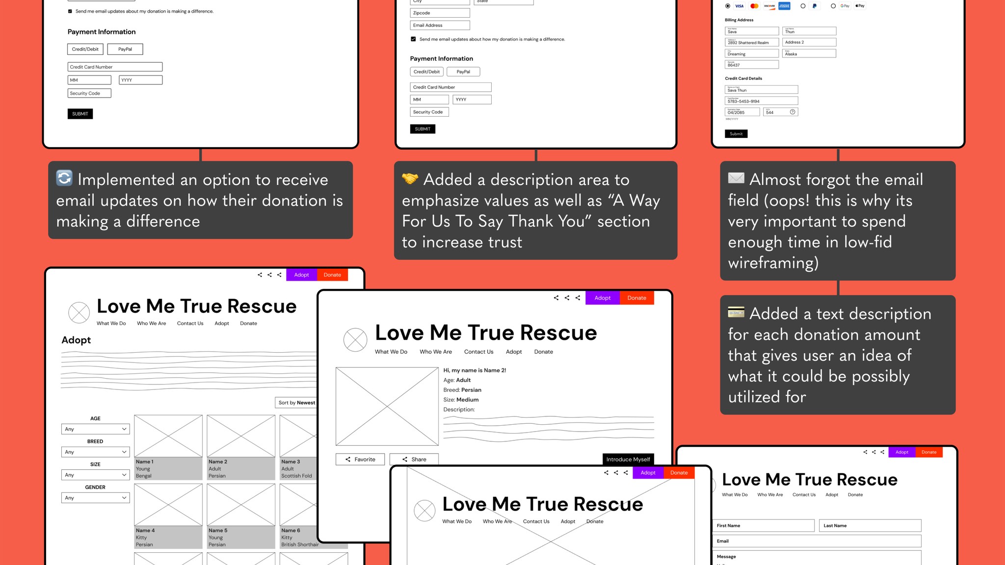
Iteration process diagram.
Explaining the "why" behind the work
After getting to a satisfactory point for our first webpage, the design PM and I presented to the stakeholder team again. We focused on explaining the reasoning behind our design decisions, starting with the problems we encountered and how we solved them.
We focused on using straightforward language to explain and defend our design decisions, emphasizing the "why" behind every choice. For example, we explained how we replaced the default sans-serif and excessive handwritten fonts with a more versatile type system, introducing a serif font for better legibility in long-form content. We explained how a refined grayscale and UI palette helps enable layered compositions that align with best practices for inputs and lead generation.
In the end, we got the go-ahead to ship this first webpage and proceeded to design the blog, about, insurance explainers, and FAQ pages.
engineering handoff
From prototype to live site
From the start of the project, I maintained open communication with the engineering team, keeping them in the loop at every stage to ensure a smooth handoff. Leveraging pre-existing practices of transparency and trust, we collaborated to prioritize responsive web design (RWD) and mobile accessibility, ensuring the final product was adaptable and inclusive.
Clarifying priorities throughout several rounds of QA helped us arrive to an MVP in a timely manner.
Testing
Shipping → whiffing → optimizing
Shipping our first approved homepage design didn’t go as expected. Early data showed conversions were actually lower than before. Recognizing there were different ways to interpret the results, the CRO strategist and I regrouped to identify any low-lift improvements that could be made.
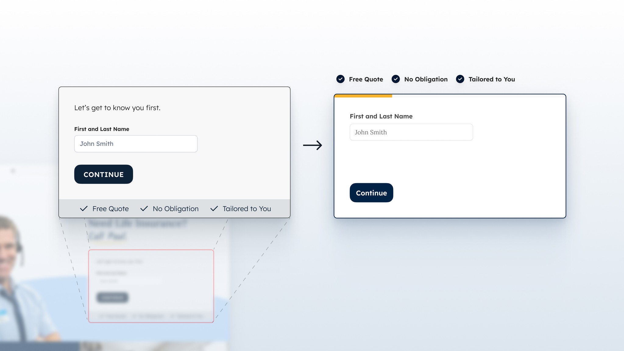
One of our first ideas was that the lead capture form in the homepage hero wasn’t as effective as it could be so I worked with the team to refine and implement updates to improve it.
before
Grayscale layering may have communicated an "inactive" state
Not very attention-grabbing
after
Progress indicator clearly communicates length, easing user commitment
Improved information hierarchy that decreases cognitive load
Outcomes
Second time's the charm
With the blended conversion rate as our main KPI, the second test outperformed the original webpage significantly, making it a resounding success.
19% increase in conversions
More users were able to learn about their health insurance options, access valuable resources, and connect with the support they needed.
A flexible foundation to build upon
Established a design system that made scaling and adapting the brand and web experience seamless
Improved cross-functional collaboration
Established and strengthened workflows between larger org teams that didn't exist before
